![]()

16. Scatter plots#
In this exercise we will learn how to plot data in scatter plots. Unlike the previous examples with histograms and density plots, scatter plots will let us look at two variables at once (i.e., bivariate relationships).
Import the libraries
#import libraries
import pandas as pd
import matplotlib.pyplot as plt
import seaborn as sns
Bring in the nyc flight data
df_flights = ?
In our previous exercises we looked at departure and arrival delays as seperate, but are they related to each other. Let’s use a scatter plot to see if higher departure delays lead to higher arrival delays.
#plot a scaterplot
sns.scatterplot(data=df_flights, x='dep_delay',y='arr_delay')
Let’s add some nicer labels to the axis of the plot.
#scatterplot with labels
sns.scatterplot(data=df_flights, x='dep_delay',y='arr_delay').set(xlabel='Departure delay (minutes)', ylabel='Arrival delay (minutes)')

#save file
plt.savefig("delay_scatterplot.png")
This plot is showing that if departure delays are high, so too will arrival delays. In other words flights that start out late are not able to make up for lost time and end up arriving at their destination late.
16.1. Estimate correlations#
We will use the corr function build into pandas to estimate the correlation between departure delay and arrival delay.
#estimate correlation
df_flights.arr_delay.corr(df_flights.dep_delay)

Try and estimate correlations between a few other variables
#take a look at potential variables to compare (i.e., what columns/variables do we have)
?
#estimate the correlation between two variables
df_flights.?.corr(df_flights.?)
What is the largest correlation you can find? Can you also plot this relationship as a scatter plot?
#Scatterplot
sns.scatterplot(data=df_flights, x='?',y='?')
16.2. Compare many variables using pair plots#
#let's choose some varibles to look at
df_flights_pairs = df_flights[["arr_delay","dep_delay","distance","carrier"]] #notice it did not use carrier... why?

#use the pairplot method to look at all combinations of these variables
sns.pairplot(df_flights_pairs)
Try and visualize the relationships between a few variables.
#Choose some varibles to look at
df_flights_pairs = df_flights[["?","?","?"]] #notice it did not use carrier... why?

#use the pairplot method to look at all combinations of these variables
sns.pairplot(?)
16.3. Heat Maps#
We will use our new found correlation skills to more effectively search for patterns in our data using heat maps! These maps can quickly help us identify high/low correlations between our variables.
#run a correlation on all combinations of variables in df_flights
corrmat = df_flights.corr()

#plot the results as a heat map
sns.heatmap(corrmat, square=False)
#plot the results as a heat map (this time let's make the figure bigger)
plt.subplots(figsize=(12,9))
sns.heatmap(corrmat, square=False)
Here we can see from the legend on the right that the lighter colours are combinations of variables that have high positive correlations. While darker colors have larger negative correlations.
Things to think about:
do all these comparisons make sense? e.g., flight# and distance?
what variable types are there?
why are year and month not showing any values?
16.4. Further reading#
Check out seaborn’s very nice page on plotting relationships using scatterplots.
If you would like the notebook without missing code check out the full code version.
16.5. Bonus material#
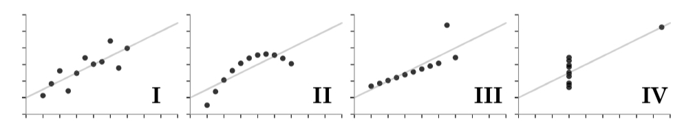
Visualizing your data is a very important step in any data science workflow. Let’s take a look at the case below where four seperate datasets have the same mean and standard deviation, but differ wildly in how their data is ditributed.
Let’s load in the data.
df_anscombe = pd.read_json("/content/sample_data/anscombe.json")

df_anscombe.head()
First let’s show that each has the same summary statistics.
df_anscombe.groupby('Series').mean()
df_anscombe.groupby('Series').std()
Now let’s take a look using scatter plots
sns.scatterplot(data=df_anscombe[(df_anscombe.Series=="I")],x="X",y="Y")
sns.scatterplot(data=df_anscombe[(df_anscombe.Series=="II")],x="X",y="Y")
sns.scatterplot(data=df_anscombe[(df_anscombe.Series=="III")],x="X",y="Y")
sns.scatterplot(data=df_anscombe[(df_anscombe.Series=="IV")],x="X",y="Y")
Even though each of these series of points have the same descriptive statistics (mean and standard deviation) they are very different in how they are distributed. This is why it is important to visualize your data!